Preface
This book (or guide, whatever you want to call it) does not always take itself seriously (I mean, the library is called
agui, what did you expect?). This is largely because I (the writer) personally find the Rust ecosystem's documentation dreadfully dull at the best of times. Now, for core libraries, I understand it; I even appreciate it! It's important that core functionality is explained well, and explained in great detail, leaving no room for misinterpretation (a comma mustn't end up being the debate of the century).That said: I don't believe this library deserves to be treated in such a robotic manner. When building UIs, we no longer are just code monkeys, tasked with building things users will never directly interact with, hiding flaws in the deepest foundation only we can see. In here, we draw, we paint, we render. We, in effect, become artists ourselves; and a robotic artist is a starving artist.
I've put personality in this book (guide) to reflect that reality. Why can't programming be fun?
Introduction
Agui is a reactive UI library, built in pure Rust, made for pure Rust. It's inspired by Flutter and other reactive UI libraries, and almost more importantly: it's renderer-agnostic. There are a few basic concepts to learn, but if you come from a background of Flutter, React, Vue, or other similar libraries, you'll feel right at home. However, I'll explain for those that have never heard of them.
User interfaces are inheritly complex and must be orchestrated properly to keep the visuals in line with the actual state of the program. Generally, this is a complex problem, and many issues can (and will) occur if you leave this "refreshing" up to the actual logic of your code. What a reactive UI library does is abstract your interface a bit to provide automatic updates to it whenever your state changes, ensuring your visuals and your state are always in sync.
However, with this ~magic~ comes additional considerations to your code. When state changes, all widgets listening to that state are updated in the UI tree. This means that you need to put some thought into limiting these rebuilds to as small of a piece of the tree as you can manage. While agui manages to reduce rebuilds where it can, it's not a magic bullet; we forgo tree-diffing for performance reasons, and to prevent problematic edge cases.
Hopefully that wasn't too much jargon for you. Just in case, here's a tl;dr: UIs are complex, use agui to make them less of a pain to handle.
Glossary
- Widget: A user interface is built on Widgets, which can be anything from pure data, to managers, to elements drawn on screen.
aguimakes little distinction between them. - Layout:
aguileverages morphorm for its layout system, which itself is modeled after the subform layout system. - State: At its core,
aguiis a state manager. It takes in your application's variables, and manages their lifecycle end-to-end, listening for changes and updating your widgets as necessary. - Global: A global is state that exists as a singleton within your application. All widgets will read and write the same data.
- Plugin: A plugin is essentially a singleton widget that does not exist in the tree. They are often used to manage one (or more) globals that other widgets may listen to.
- Computed Values: A function that returns a value, only causing updates to the widget if the returned value changes.
- Key: A key is a way to instruct
aguito cache a widget between rebuilds.
Stability Warning
While the core of Agui is mostly stable, it is still very much in its infancy. The API may change, and optimizations still need to be done, especially when it comes to talking to the render integrations, and the integrations themselves. We are still finding our way, and that will take time. That said: it works. If you need a feature that doesn't exist, feel free to contribute or make a plugin!
Contributing
Agui is free and open source. You can find the source code on GitHub, issues can be posted on the GitHub issue tracker, with feature requests and questions directed to Github discussions.
Getting Started
Installation
agui is available on crates.io, Rust's official package repository. Just add this to your Cargo.toml file:
[dependencies]
agui = "0.3" # ensure this is the latest version
Hello, world!
First, you need to select your integration. To get started quickly, we're going to run with agui_wgpu since it's the most feature complete.
The smallest program you can start up to render something can be found in agui_wgpu/examples/hello_world.rs:
fn main() {
    let mut ui = UIProgram::new("agui hello world")?;

    // Register some default behavior
    ui.register_default_plugins();
    ui.register_default_globals();

    let deja_vu = ui.load_font_bytes(include_bytes!("./fonts/DejaVuSans.ttf"))?;

    // Set the root node of the UI
    ui.set_root(build! {
        <App> {
            child: <Text> {
                font: deja_vu.styled(),
                text: "Hello, world!"
            }
        }
    });

    // Start the update loop
    ui.run()
}
There's a little initial setup to create the GpuProgram and UI, most of what we care about is loading the font and ui.set_root. The build! macro will be explained soon. How fonts work will be explained a bit futher in a later section.
With the above code, you should be left with something like this:
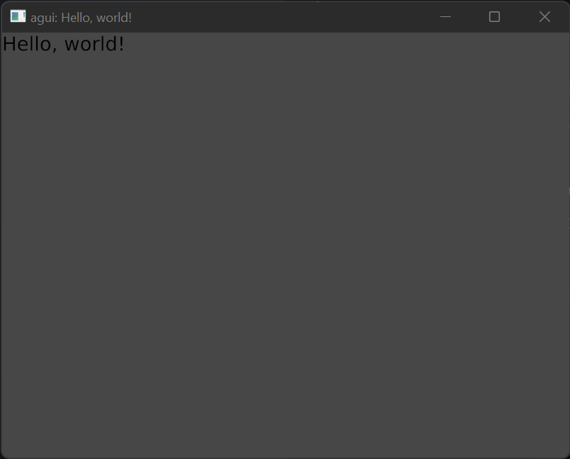
Truly remarkable.
Yeah, it's not much to look at, but we'll build on this in future sections to make more elaborate (and reactive!) interfaces.
Macros
Before we get too much further, you must understand some of the macros we'll be using in this guide. There are two main ones that agui provides.
The build! macro
This is a convenience macro. It's not technically required (in fact it's quite easy to never use it) but it makes our life a bit easier. In exchange for some black-box magic, you get better maintainability and better looking code. It supports pretty much all of Rust syntax, so you can embed logic (such as if or match statements) within it as normal.
// Before:
fn build(&self, ctx: &mut StatelessBuildContext) -> BuildResult {
    BuildResult::Some(vec![
        Button {
            layout: Layout {
                sizing: Sizing::Set { width: 64.0, height 32.0 },
                ..Layout::default()
            }.into(),
            ..Button::default()
        }.into()
    ])
}

// After:
fn build(&self, ctx: &mut StatelessBuildContext) -> BuildResult {
    build!{
        Button {
            layout: Layout {
                sizing: Sizing::Set { width: 64.0, height 32.0 }
            }
        }
    }
}
Doesn't that look nice? Essentially all it is doing is adding .into() to your blocks and adding Default::default() to your structs. Note that it does make many assumptions, notably that every struct will #[derive(Default)].
#[functional_widget]
The vast majority of widgets are simple fields followed by a single build() function. This means we have room for simplification: why not just make our function our widget? Well alright then. Ask and ye shall receive.
#[functional_widget]
// The macro will turn `snake_case` into `PascalCase` for the widget name
fn example_widget(ctx: &BuildContext, layout: Layout, child: WidgetRef) -> BuildResult {
    ctx.set_layout(Layout::clone(&layout));

    build!{
        Button {
            child: child
        }
    }
}
See? Instead of establishing a struct called ExampleWidget with the fields of layout and child, we can just make a function and tag it with the macro. The ctx: &BuildContext parameter is required, and any following arguments are added as a struct field. Of course, all of this comes with assumptions and potential overhead. Any field used here must implement Default + Clone in some form or another, so that the widget may call the example_widget function without issue.
Widgets
A widget is anything that exists in the UI tree. It could be a visual element, a management system, or just plain-ol-data. You can find a full list of them in the Widget Reference.
Primitives
agui comes with a set of extremely simple widgets that are referred to as Primitives. These generally cover the most basic renderable ~things~ or other extremely useful widgets that don't offer much opinionated functionality, but are still very useful. Render integrations hook into these to draw the actual visual elements, giving a very small barrier to entry to have all features of agui. You can find a full list of them in the Primitive Widget Reference.
Creating a Widget
A widget consists of two things: its settings and a build function. In Rust, this is just a struct with an impl StatelessWidget. We're going to start simple, with a basic box on the screen:
pub struct MyWidget { }

impl StatelessWidget for MyWidget {
    fn build(&self, ctx: &mut StatelessBuildContext) -> BuildResult {
        BuildResult::None
    }
}
If you run this... Nothing will happen. Which makes sense, as we don't have any widgets that actually render anything. Lets add one and give it a size.
impl StatelessWidget for MyWidget {
    fn build(&self, ctx: &mut StatelessBuildContext) -> BuildResult {
        build! {
            Button {
                layout: Layout {
                    sizing: Sizing::Set { width: 64.0, height 32.0 }
                }
            }
        }
    }
}
This should render a button on screen that's 64x32 pixels. Pretty swick, if I do say so myself. Button is one of our built-in widgets; its implementation is not important just yet, so don't worry about that for now. One important thing to note is clipping is not enabled by default. We'll cover why that is and the implications of that in a later section.
Layout
agui leverages morphorm for its layout system, which itself is modeled after the subform layout system. While we go into some detail here, it's recommended to do some research into those as well until this page is fleshed out a bit more.
Why subform? Why not flexbox?
Because, frankly, flexbox is confusing. We need something simpler, that doesn't interact with itself in invisible ways or bring in new concepts such as align-items, justify-content, or align-self. According to Subform themselves, the tl;dr is:
- All elements have a horizontal and vertical axis, each of which consists of space before, size, and space after.
- Elements either control their own position (“self-directed”, akin to CSS absolute positioning) or are positioned by their parent (parent-directed).
- Parents can position their parent-directed children in a vertical stack, horizontal stack, or grid.
- The same units—pixels, percentages (of the parent size), and stretch (akin to flex, proportionally dividing up available space)—are used everywhere, with minimum and maximum constraints as part of the unit.
At its most basic level, your layouts are just rows and columns of widgets, each of which may contain more rows and columns of widgets. Beyond that, sizes of your widgets can be pixels, a percentage of the parent, or stretch to fill. That's it. Stupid simple.
How do I use it?
There are some primitive widgets that make the layout system easier to grok. Column, Row, Grid, Padding, and Spacing, each of which simply abstract out the layout. While you could use ctx.set_layout for each widget yourself, it's recommended to use these widgets instead, as it makes your widgets simpler and more reusable.
State
Widgets may contain their own, self contained state, which persists across rebuilds (usually—more on that in a minute). Whenever the state changes, the widget's build() function will be re-invoked, and its children will be rebuilt. This is your main tool for implementing a user interface that can react to user events. Lets write up a quick counter example to demonstrate this:
#[functional_widget]
fn counter_widget(ctx: &BuildContext, font: FontId) -> BuildResult {
    let num = ctx.use_state(|| 0);

    let on_pressed = ctx.use_callback(|ctx, ()| {
        let mut num = ctx.get_state::<i32>();

        *num += 1;
    });

    build! {
        Column {
            children: [
                Text::is(font, 32.0, format!("clicked: {} times", num.read())),
                Button {
                    child: Padding {
                        padding: Margin::All(10.0.into()),
                        child: Text::is(font, 32.0, "A Button".into())
                    },
                    on_pressed
                }
            ]
        }
    }
}
Any time you mutate state (for example, the num), it will cause any listening widgets to be rebuilt on the next update. The first time ctx.use_state(|| 0) is used, the closure within the method is called to initialize the state. In this case, it will be initialized to zero. On subsequent rebuilds of the widget, the previous state that it was in will be persisted. However, this only applies if the parent of the widget is not rebuilt.
If you want to create state, but not listen to changes to it, you can instead use ctx.init_state. This is useful for widgets that manage state that children respond to, but state that itself doesn't react to. If you were to use that above, instead of use_state, the value would have changed internally, but you wouldn't see any change to the UI. On the same note, get_state fetches state without listening to it (much like init_state), but doesn't provide a default value: this means it may panic if you do not init the state, first.
The use_callback function is used primarily to allow widgets to interact with each other. We create a callback and pass it into the button widget, letting us be notified when it is pressed. You may be wondering why we have to use get_state, and this is due to the guarantees Rust enforces. We must fetch the state from the widget in the callback, rather than cloning around pointers.
Globals
A global acts much the same way as state, but it exists once in your application and is shared amongst all widgets, no matter how deep they are in your tree.
#[functional_widget]
fn widget_with_global(ctx: &WidgetContext) -> BuildResult {
    let state = ctx.use_global(|| 0);

    build! {
        Drawable {
            layout: Layout {
                sizing: Sizing::Set { width: 64.0, height 32.0 }
            }
        }
    }
}
In this case, use_global will fetch the global state or initialize it to zero if it does not already exist.
Parental Rebuilds
When a widget is rebuilt, its state is persisted. However, any children it has will be reinitialized, meaning their state will be destroyed. This means you need to be careful in how you structure your interface to reduce rebuilds, and to work around this limitation. For more information on this, you can see Limiting Rebuilds.
Fonts
agui comes with a built-in font system. In order to render text, you must begin by loading the font into agui; this is because the layout system must know how large text will be before rendering. While each integration may have their own methods for doing so, most of them should follow the same general convention. Using agui_wgpu as an example, we just need to load the font file, or bytes:
fn main() {
    let mut ui = UIProgram::new("agui hello world")?;


    // Import font bytes directly
    let font = ui.load_font_bytes(include_bytes!("./fonts/DejaVuSans.ttf"));

    // Import a font file
    let font = ui.load_font_file("./fonts/DejaVuSans.ttf");
}
The function returns a Font which is used to reference the font in your UI. This can be stored however you like, and is generally used when creating Text widgets:
Text {
    font: deja_vu.styled().size(32.0),
    text: "Hello, world!"
}
Supported Font Formats
We use glyph_brush to handle laying out fonts/glyphs, which itself utilizes ab_glyph. Therefore, we support any font format they do. At the time of writing, agui only supports loading TTF fonts.
Clipping
Clipping gets its own section because, while it's useful, it comes with some very important drawbacks. One thing to keep in mind is that child widgets are not clipped by default.
Motivation and Usage
This part of the docs are currently unwritten. If you wish to contribute, feel free to make a pull request.
Keyed Widgets
Occasionally you'll run into a situation where you are absolutely positive that child widgets will not react to a parent rebuilding. In these cases, keyed widgets come to the rescue. However, they must be used carefully as they may cause logical inconsistencies or non-deterministic behavior if used incorrectly. Another way to think of them are as "cache keys" instead of just keys.
There are two types of keys, at the time of writing:
- Local: These are scoped to the widget creating the key, and don't propagate down to children.
- Global: These are scoped to the entire application, meaning widgets can move around the tree in certain situations.
There's also a third "type", and that's unique keys (which are really just Global keys). These are explained in a bit more detail below.
Motivation and Usage
Imagine a situation where you have a widget which only provides layout sizing to its children, and reacts to some global state to set that size. This is the exact situation for the App widget:
#[functional_widget]
fn app(ctx: &BuildContext, child: WidgetRef) -> BuildResult {
    // Fetch the `WindowSize` global, which contains app sizing information
    let window_size = ctx.use_global(WindowSize::default);

    // Set the sizing of this widget, so children may take up the entirety of the app size
    ctx.set_layout(Layout {
        sizing: Sizing::Axis {
            width: Units::Pixels(window_size.width),
            height: Units::Pixels(window_size.height),
        }
        ..Layout::default()
    });

    // Return the child
    child.into()
}
In this case, this would cause child widgets to be rebuilt whenever the app size changes (think window resizing), incurring potentially expensive tree operations and absolute state loss of all children. In this case, we can guarantee that the widget rebuilding won't change the children in any way. Given these guarantees, we can use a Key. Simply change the last line to this:
// `Key::single()` is a helper alias of `Key::Local(0)`
ctx.key(Key::single(), child).into()
This will cause the child widget to be cached and reused when the parent App widget is rebuilt, instead of recreating it from scratch. The exact meaning of this line will be elaborated on in a moment.
Limitations
Keys are limited in how they function, and it's important to understand these limitations to use them effectively.
Most notably, only one key with the same value may exist in any given scope. Two local keys with the same value may not exist in a single widget, but two separate widgets (even if one is a child of the other) may share exact values without issue. The same cannot be said for global keys, which must exist once in the entirety of your application. If you break this convention, your application will panic! if two keys clash during a rebuild.
Additionally, keys only function if the widget is removed and re-added to the tree within a single update. If you have a keyed widget that gets removed from the tree, but then gets added back into the tree in a subsequent update(), then it will be regenerated anew.
Local Keys
Local keys are just as the name implies: they're local to the widget that defined them. If your widget can function using local keys, it's highly recommended to use them over any other since they come with the fewest strings attached.
Key::single() // If the widget only contains one keyed widget

// Otherwise, we use

Key::local(hashable_value)

// or

Key::Local(u64)
Global Keys
Global keys, just like globals, can be used throughout the entirety of your application. They must follow the convention of each key being entirely unique to your application, and should not be used by third party widget crates. Third parties should use unique keys, or accept a key as a parameter.
Key::global(hashable_value)

// or

Key::Global(u64)
Unique Keys
Unique keys are global keys, but they're designed to be passed as an argument to child widgets. These are non-deterministic, and a new one should be generated each time one is created, using Key::unique().
Computed Values
Computed values are an extremely useful construct. They can listen to state and react to it, but will only cause the widget they're defined in to rebuild if their return value changes. Instead of implementing an event listener system, we use computed values to achieve the same effect.
Motivation and Usage
Sometimes you'll want to listen to some state, but your widget will not always react or otherwise respond to that state change. In cases where this can be guaranteed (and deterministically tested against), we can use computed values to achieve this effect. To demonstrate them, we'll check if the user is currently hovering over the widget by utilizing the HoverPlugin:
#[functional_widget]
fn hovering_widget(ctx: &BuildContext) -> BuildResult {
    let is_hovering = ctx.computed(|ctx| {
        // We use `try_use_global` here, since we don't want to test for hovering if the plugin isn't loaded
        if let Some(hovering) = ctx.try_use_global::<Hovering>() {
            if hovering.read().is_hovering(ctx) {
                true
            }
        }

        false
    });

    build! {
        if is_hovering {
            Button {
                layout: Layout {
                    sizing: Sizing::Set { width: 64.0, height 32.0 }
                }
            }
        }else{
            Button {
                layout: Layout {
                    sizing: Sizing::Set { width: 32.0, height 64.0 }
                }
            }
        }
    }
}
In this case, the computed value's closure will be called whenever the Hovering global is updated, but will only mark the widget for rebuild when it returns a different value. In this case, it will only rebuild when it goes from a non-hover state to a hover state and vice versa.
Limiting Rebuilds
Rebuilds are at the heart of how agui works. Whenever state changes, the widgets in the tree that may change are updated. However, this is a very naïve system and much of the responsibility for limiting these rebuilds is up to the developer (you). We'll go over the problem, and devise a few solutions for it, however ultimately the decision is up to you.
Builders
Builders are essentially closure-derived widgets. You can create these ad-hoc to limit the scope of rebuilds to a sub-tree of widgets, because they're essentially parent-widgets themselves with their own BuildContext.
#[functional_widget]
fn widget_with_builder(ctx: &BuildContext) -> BuildResult {
    build! {
        Builder::new(move |ctx| {
            // `ctx` is a new `BuildContext` which will not affect the parent widget

            let state = ctx.use_state(|| 0);

            build! {
                Button {
                    layout: Layout {
                        sizing: Sizing::Set { width: 64.0, height 32.0 }
                    }
                }
            }
        }
    }
}
Globals
Another option is utilizing globals. You can create state, then create sub-widgets which listen to that state, resulting in potentially fewer rebuilds of your application with little effort. However, this has the effect of making it difficult to grok exactly what your application is doing if used incorrectly, and potentially makes limiting the scope of rebuilds more troublesome as your application grows. You can read more about it here.
Providers and Consumers
Instead of globals, you can use Providers. This is an optional plugin which makes state available to its subtree of widgets, however it's not free. Whenever a child needs to access the state, it needs to traverse the tree to find a parent which is providing that state. This is often negligable, but as your application grows it may become more pronounced if the children that use the state are deeper in the tree.
Providers & Consumers
The provider pattern can provide (hah!) some much needed structure to your state. That's why agui provides (hah) this plugin in agui_widgets, to provide (hah—okay, I'll stop) some standardization to this extremely useful pattern.
Motivation and Usage
As your application grows, using globals can get messy. It becomes increasingly difficult to understand where state is mutated, and what widgets are listening to said state. It also makes your code significantly less reusable. In contrast to widget state or globals, the provider pattern acts as the middleground between these two possibilities: it makes state available only to children of a widget, rather than to the entirety of the widget tree.
A perfect example of where this pattern shines is in Theme, of which we cover in more detail in this section. Themes are generally "global" (in the sense that you want everything to look the same), but sometimes you want the style of your widgets to be different in a certain part of your application. The widgets agui provides use Theme extensively, making it simple for you to style your application however you desire.
Providing State
To provide some state, we just need to provide it somewhere in the widget tree:
use agui::widgets::plugins::provider::ProviderExt;

#[functional_widget]
fn provider_widget(ctx: &BuildContext, child: WidgetRef) -> BuildResult {
    // The generic isn't required, here; it's just used for clarity.
    let some_number = ctx.use_state::<usize, _>(|| 0);

    // `ProviderExt` gives an easy-to-use extension trait onto `State` (which is what `use_state` and `init_state` return).
    some_number.provide(ctx);

    // This child, and all children within it, will now have access to `some_number`, as long as they Consume it properly.
    child.into()
}
Consuming State
Consuming from a provided state is also extremely simple; the main difference in usage between this pattern and globals is that use_global will init non-existent values, but the Provider pattern will return None if it doesn't exist in the tree.
use agui::widgets::plugins::provider::ConsumerExt;

#[functional_widget]
fn provider_widget(ctx: &BuildContext, child: WidgetRef) -> BuildResult {
    // This will be ignored by `ctx.consume` since it's not provided.
    let some_number = ctx.use_state::<usize, _>(|| 0);

    // `ConsumerExt` gives an easy-to-use extension trait onto `BuildContext`.
    if let Some(some_number) = ctx.consume::<usize>() {
        // Use `some_number`, here.
    }

    BuildResult::None
}
Hovering
The HoverPlugin listens to the Mouse global, detecting what widgets the mouse is currently hovering over. This can be used for animations, click detection, and in many other scenarios where mouse interaction is required.
Motivation and Usage
Without user interaction, a user interface isn't exactly, well, a user interface. There's also great value in reducing exact mouse position events into a single listener that can then "broadcast" coarser events to any widget that cares about them. Imagine if every button in your widget tree was getting updated every single time the mouse position changed—it would cause an unfortunate amount of update calls for an event that, realistically, doesn't need to be that fine-grained.
So, the HoverPlugin solves that problem. It consumes mouse positions and writes to the Hovering global only when the widget you're hovering over changes, saving CPU and reducing the errors that could occur if every widget was implementing this functionality themselves.
To use it, it's highly recommended to listen to it within a computed value, so your widget is only rebuilt when its hover state changes.
#[functional_widget]
fn hovering_widget(ctx: &BuildContext) -> BuildResult {
    let is_hovering = ctx.computed(|ctx| {
        // We use `try_use_global` here, since we don't want to test for hovering if the plugin isn't loaded
        if let Some(hovering) = ctx.try_use_global::<Hovering>() {
            if hovering.read().is_hovering(ctx) {
                true
            }
        }

        false
    });

    build! {
        if is_hovering {
            Button {
                layout: Layout {
                    sizing: Sizing::Set { width: 64.0, height 32.0 }
                }
            }
        }else{
            Button {
                layout: Layout {
                    sizing: Sizing::Set { width: 32.0, height 64.0 }
                }
            }
        }
    }
}
No matter how often the Hovering global changes, the widget will only be rebuilt when is_hovering matches and the function returns true. If you didn't use the computed value, the widget would be rebuilt every time the currently hovered widget changed, which wouldn't be good.
Primitives
Primitive widgets are the most basic widgets that exist; they are generally unchanging and very unopinionated. Virtually every project that utilizes agui will use these as their most basic, most stable widgets.
Layout
There are various widgets designed to abstract the layout to make their behavior clearer. It's recommended to use them whenever possible, so design and functionality are standardized both within your application and within all agui applications.
Basics
- Column: A column stacks child widgets vertically, with an optional
spacing. - Row: A row lines up child widgets horizontally, with an optional
spacing. - Padding: Creates a widget with
margin, effectively creating an internal padding in the widget.
Spacing
The Spacing widget is another useful helper which can be used to create arbitrary distance between two widgets by utilizing its helper functions.
Spacing::none() // Creates the widget with null spacing.

Spacing::horizontal(Units) // Creates a widget with `Units` width.

Spacing::vertical(Units) // Creates a widget with `Units` height.
What if I don't want to use it?
Well, then your life just got a lot more complicated. Widgets that don't wish to use Drawable must implement their own renderer in the integration they're using. See your integration's respective docs to see how to do this.
Text
Just like Drawable, this is how you tell the renderer to draw Text in your interface. Its default functionality is slightly different from other widgets, so it's important to note here: by default, this widget will set its size to the width of the text as rendered. If you want it to take up less space, ensure you set its sizing field.
Widgets
This part of the docs are currently unwritten. If you wish to contribute, feel free to make a pull request.
App
This part of the docs are currently unwritten. If you wish to contribute, feel free to make a pull request.
Button
This part of the docs are currently unwritten. If you wish to contribute, feel free to make a pull request.
Globals
agui includes some default application globals to standardize some common functionality. This includes Mouse, Keyboard, Theme, among other things we'll go over in the next few sections.
Who implements these?
When building an integration for new renderer, including some of the systems necessary to update these globals is largely non-negotiable. agui has no way to know how to update Mouse or Keyboard state, as the core doesn't implement a windowing system, so this is left entirely to the integrations. It's unnecessary to go much deeper in this section, but will be covered later. Rest assured the functionality is standardized across integrations.
Mouse
This part of the docs are currently unwritten. If you wish to contribute, feel free to make a pull request.
Keyboard
This part of the docs are currently unwritten. If you wish to contribute, feel free to make a pull request.
Themes
Having a standardized Theme system is necessary for an easy-to-use UI library. However, we don't use a single struct for styles, as this is wasteful and would not cover every use case. Instead, each widget should create a struct with style information, that derives the traits: Default + Send + Sync.
Usage
Lets go over how the Button widget handles its styling, as an example:
#[derive(Debug, Clone)]
pub struct ButtonStyle {
    pub normal: Color,
    pub disabled: Color,
    pub hover: Color,
    pub pressed: Color,
}

impl Default for ButtonStyle {
    fn default() -> Self {
        Self {
            normal: Color::White,
            disabled: Color::LightGray,
            hover: Color::LightGray,
            pressed: Color::DarkGray,
        }
    }
}
This houses all of the fields that the Button widget uses to determine how it will render. When it actually wants to utilize that style, we use the StyleExt extension trait.
use agui::widgets::state::theme::StyleExt;

#[functional_widget]
fn button(ctx: &BuildContext, style: Option<ButtonStyle>, child: WidgetRef) -> BuildResult {
    // `resolve` will perform the following steps to get the style:
    //   1. If the style is `Some`, return it
    //   2. Check for a widget that's providing a Theme, and get_or_default from that
    //   3. Check global state for a Theme, and get_or_default from that
    //   4. Use the Default style
    let style: ButtonStyle = style.resolve(ctx);

    BuildResult::None
}
Notice that the style field is an Option. The StyleExt trait also supports this type, making it simple to allow style overrides without additional checks.
Animations
This part of the docs are currently unwritten. If you wish to contribute, feel free to make a pull request.
All hope abandon, ye who enter here.
Deeper Understanding
Understanding the internals of agui is not necessary to be productive while using it. For those just getting started, or those that need something that "just works," this is a fantastic place to stop reading. In fact, I suggest you do so. Everything you need to hear has already been said, everything you need to see has already been shown.
However, for those that wish to contribute (or those that are merely morbidly curious), the remainder of this book will give a good overview of how the internal systems work and function together. Further understanding exists by reading the code, should you desire it.
To keep things digestible, we'll start at the core systems and tack on layers from there, gradually increasing the complexity until every system has been explained in as deep of detail one can without too much technical jargon (in fact, the order in which it's explained is the order in which it was developed). By the end of it, either you'll be more confused than you started, or you'll run for the hills, because further reading is not for the inexperienced programmer, nor the faint of heart.
Here be dragons.